International Olympic CommitteeGames Learning Platform2025
Reimagining Learning
- Timeline
- Apr – Jun 2025
- Role
- UI design — imagery, visual design, illustration, dev handoff
- Tools
- Figma, FigJam, WCAG 2.1, Trello
TL;DR
The Games Learning Platform is a centralised hub for all mandatory training related to the Olympic Games. It brings together learning materials for organisers, volunteers and other stakeholders who plan, deliver and run the Games, so everyone has the knowledge and resources they need in one place.
Challenge
Lost in a learning maze
The Learning Platform was visually outdated and lacked an engaging user experience. It was built on EdCast components, which offer limited design flexibility, so the client believed significant improvements were out of reach.
The platform’s complex content structure also lacked visual hierarchy. That made it difficult for users to navigate, understand the overall context and engage with the learning experience.
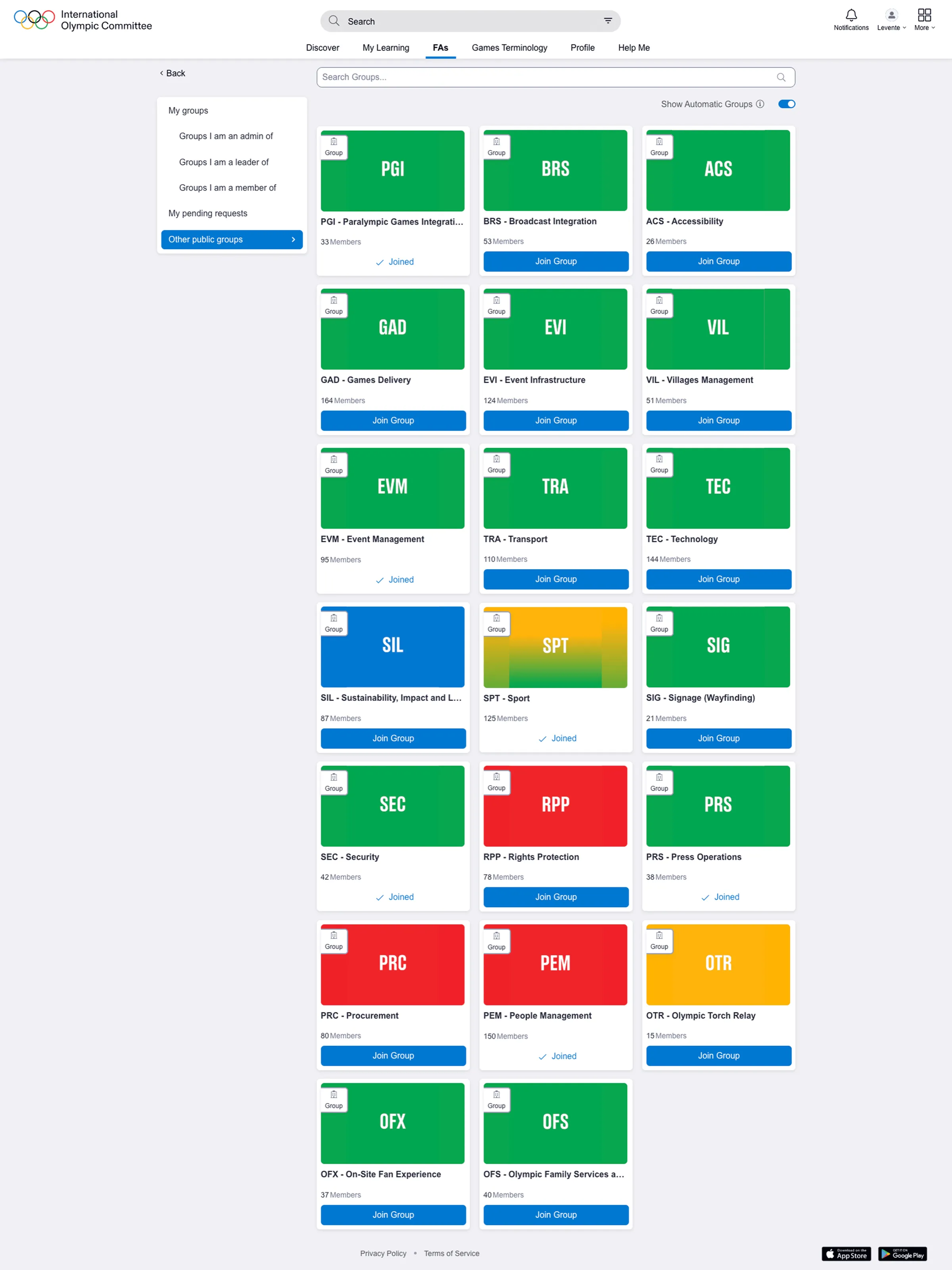
Before
Groups page
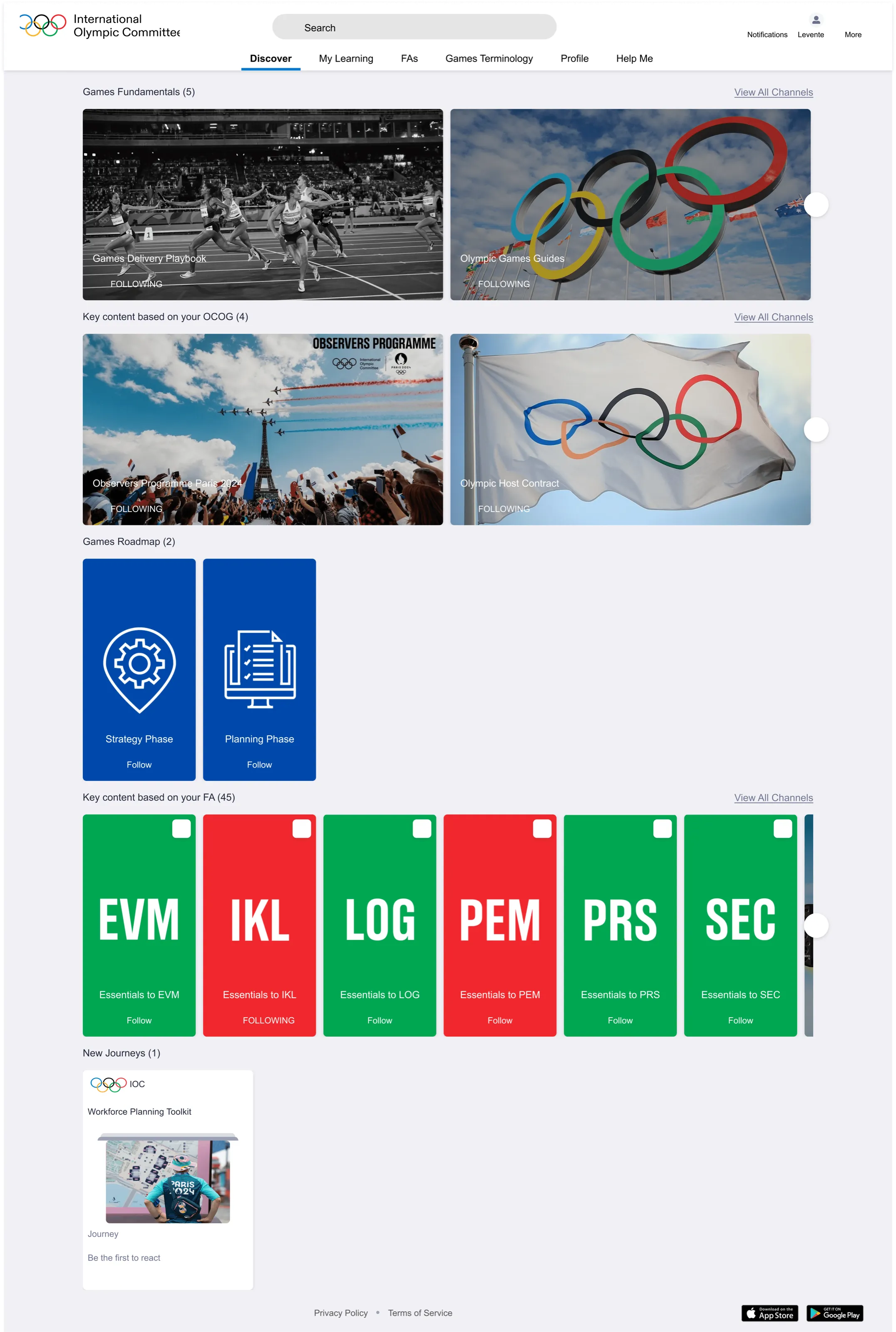
Before
Homepage
Process
Project timeline
Apr 2025
01
Discovery
- Project kickoff with stakeholders to identify pain points and clarify the vision.
02
Research & Strategy
- Analysed platform structure and hierarchy.
- Benchmarked competitors and gathered inspiration to define the design direction.
- Created the information architecture.
- Explored EdCast limitations in a sandbox.
03
Concept & Validation
- Ideated and designed homepage concepts.
- Gathered team feedback on feasibility and content.
- Presented proposals to stakeholders for alignment.
04
Visual Design
- Iterated on visuals and designed subpages, banners and learning material covers.
- Tested ideas in the sandbox with team consultations.
05
Finalisation & Handoff
- Created reusable templates for banners and covers to keep visuals consistent.
- Delivered final Figma files during a QA handoff session.
Jun 2025
Visual design
Defining hierarchy: colours and shapes
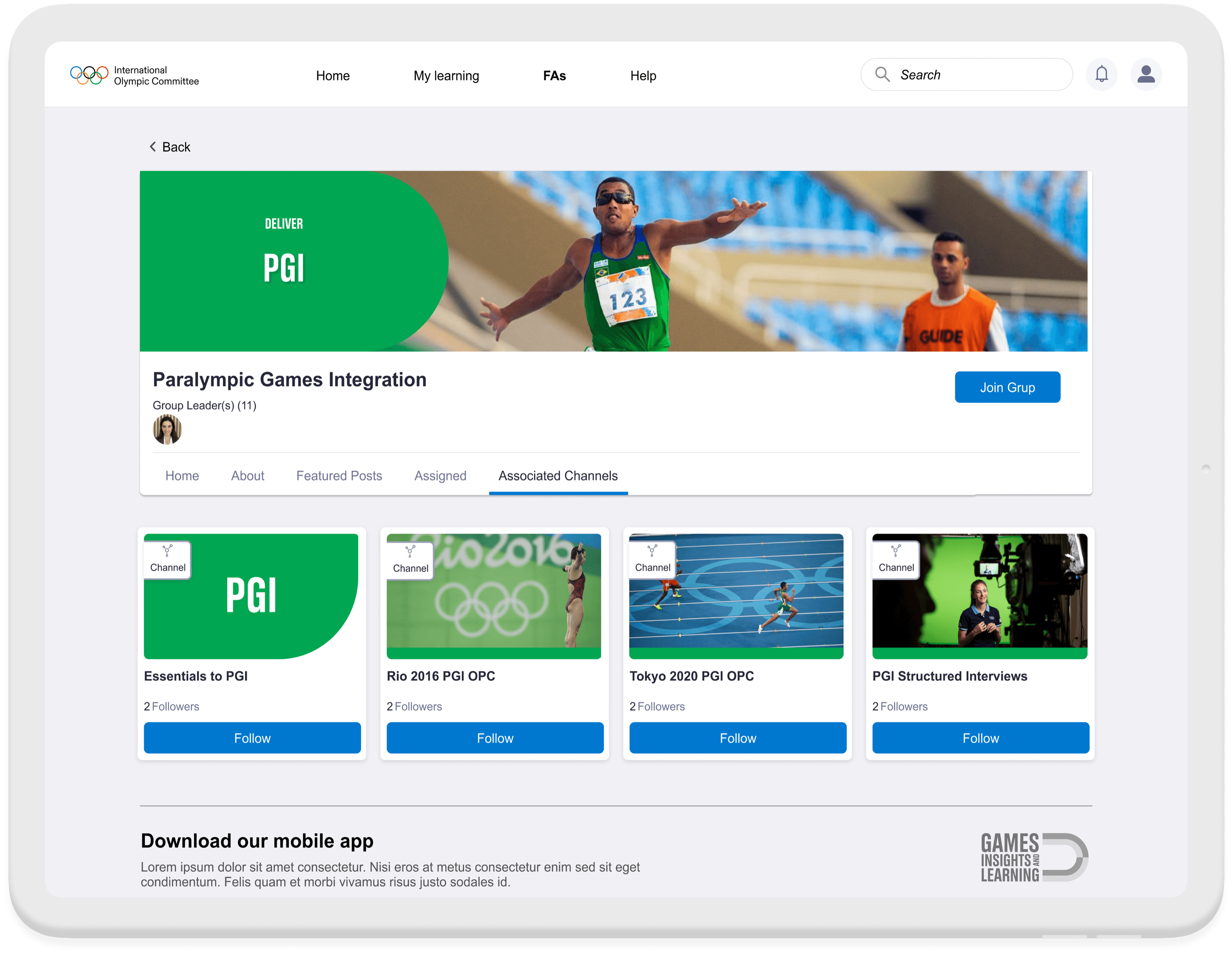
Learning materials are organised into five portfolios, each with a signature colour. The platform hierarchy spans five levels:
- Grouptop level
- Channelfor posting materials
- Journeygrouping related content
- Pathwayfor complex learning tracks
- Smart Cardindividual learning items
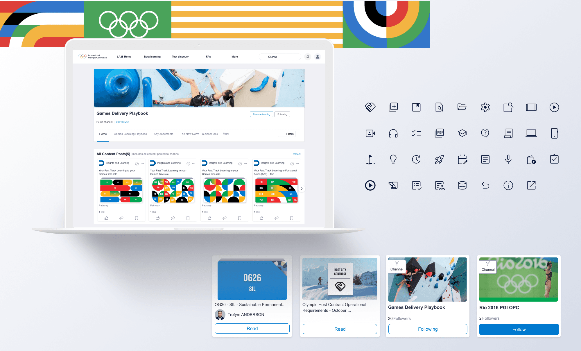
To improve visual clarity despite the limited components, I introduced simple shapes that refer to the IOC’s “rounded” branding, and colour coding to represent each level of the hierarchy. The platform structure became easier to understand at a glance.
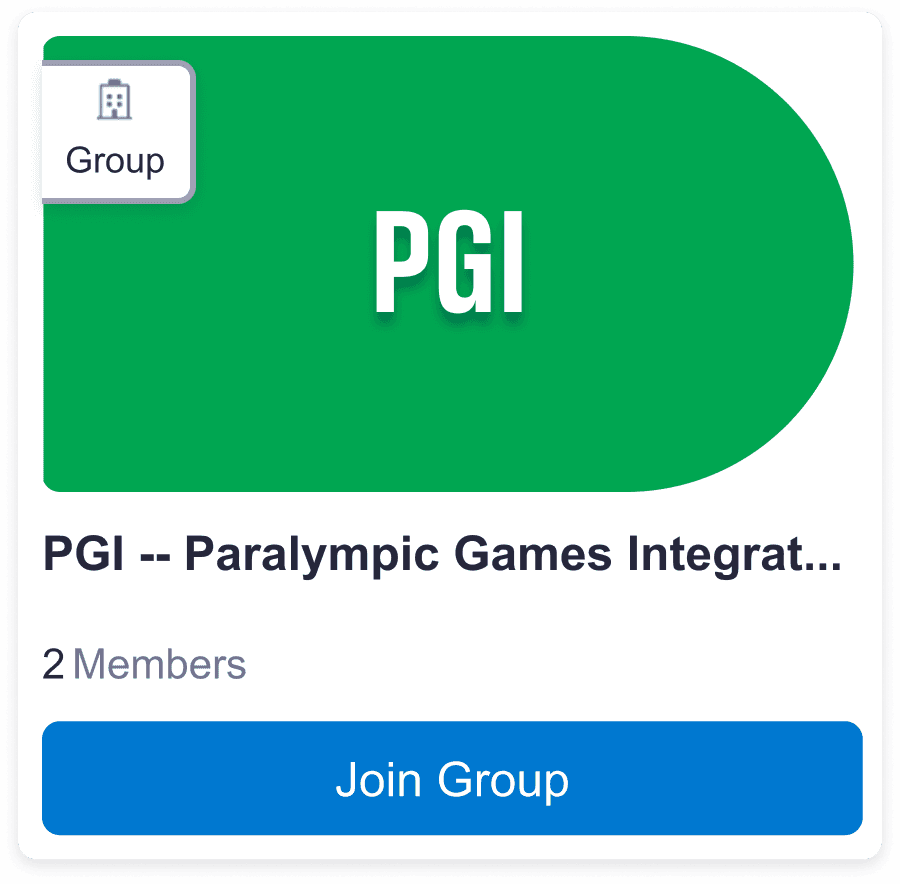
Group
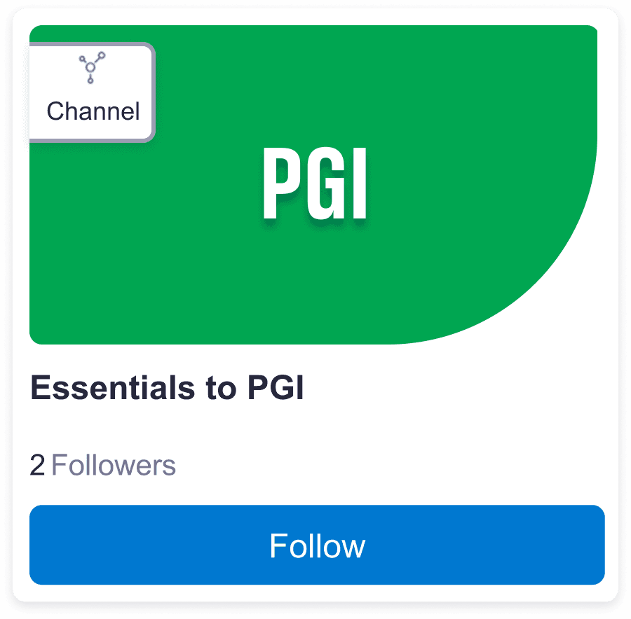
Channel
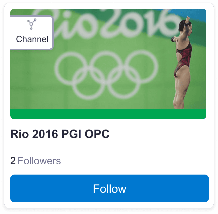
Channel with photo
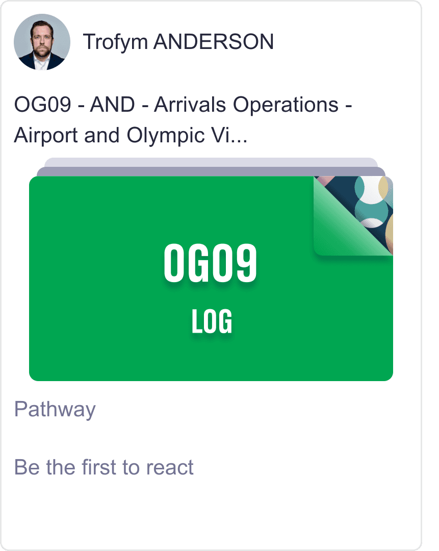
Pathway
Landing page
A clear starting point instead of endless carousels
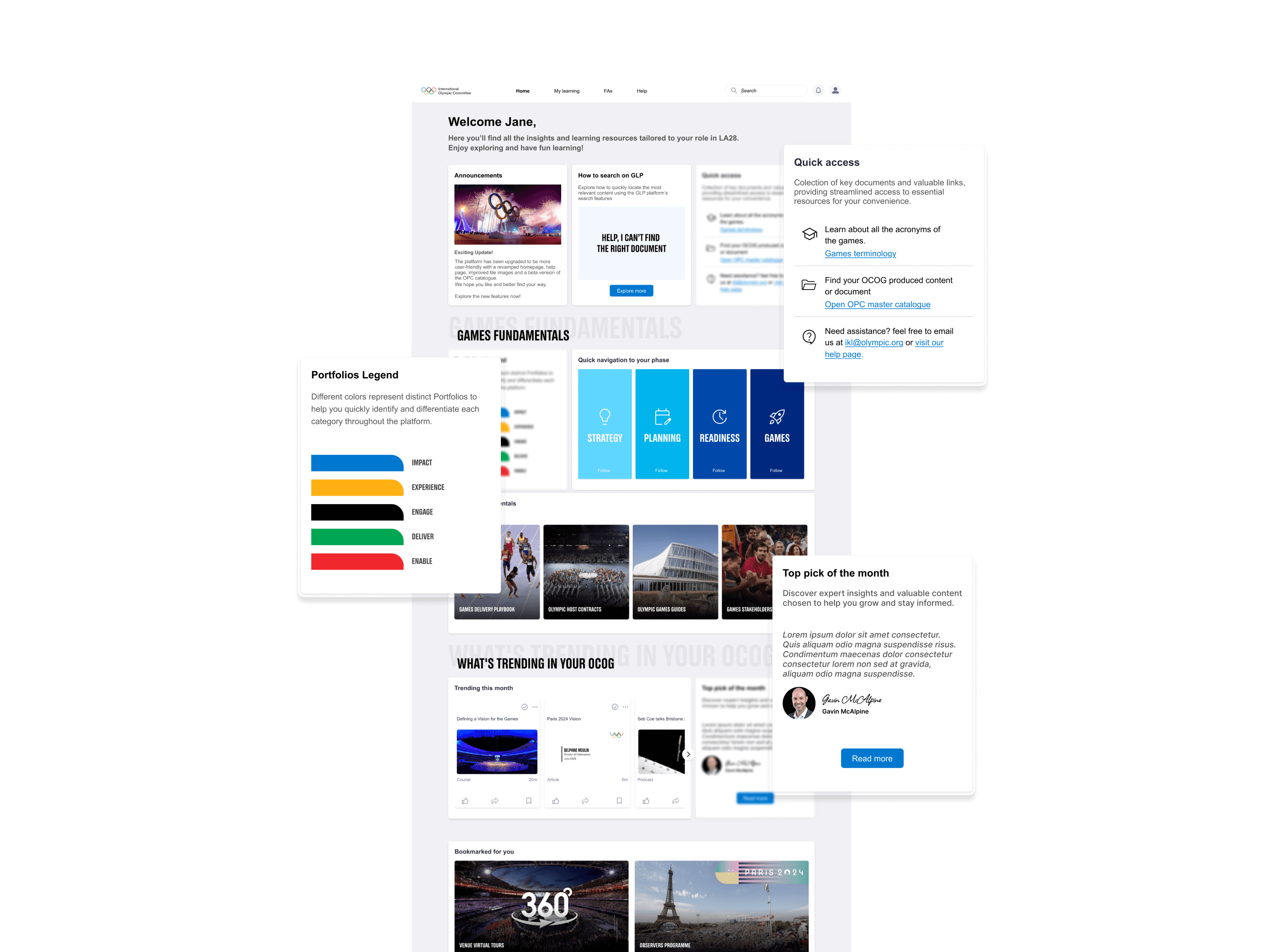
The previous GLP homepage lacked a proper entry point. It relied on multiple carousels, with no clear place for users to start. To create a more intuitive and engaging experience, I redesigned the homepage with:
- a welcoming section with announcements and quick-access links,
- clearly defined sections for better content organisation,
- a portfolio legend to help users quickly identify the five learning groups,
- a “Top Pick of the Month” feature, highlighting expert-recommended learning curated by an IOC specialist.